Disease spread
using a cellular automaton
In the late 1960's the mathematician John Conway devised the Game of Life (sometimes just called Life). It is an example of a simulation running as a cellular automaton, that is, a grid of cells that can indicate two or more different states. In the original version the cells could be either occupied or vacant. Such constructs can be fun and have interesting mathematics, and, because of their very visual nature, work very well for demonstrating some phenomena.The example below shows a cellular automaton devised by M Cole that was inspired by the spread of a virus through a population where some number may be immune to infection either through having previously had the infection or through vaccination.
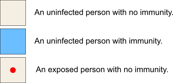
Step 1: The board starts with a population of uninfected people, some of which may have immunity. At the centre is a single person that has been exposed to a virus. The cells are colour coded as follows:
Step 2:
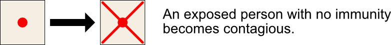
Step 3:
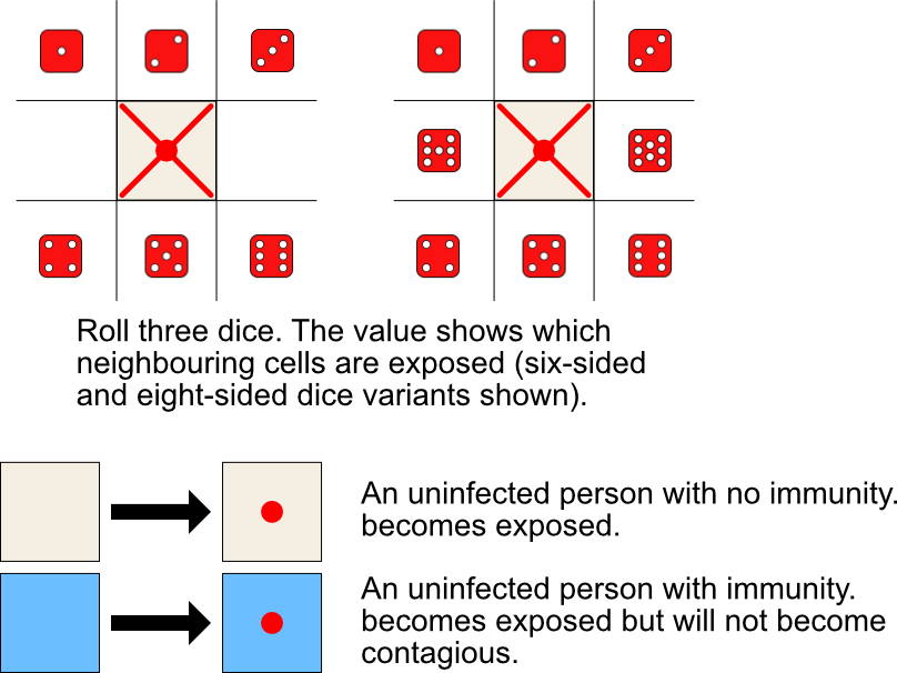 Step 4:

Steps 2 to 4 are repeated until no more moves are available.
Dr Peter Rowlett of Sheffield Hallam University has produced a pre-made grid to download and use if you want to play the paper version.
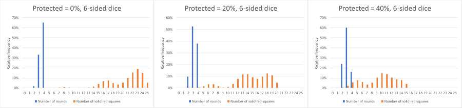
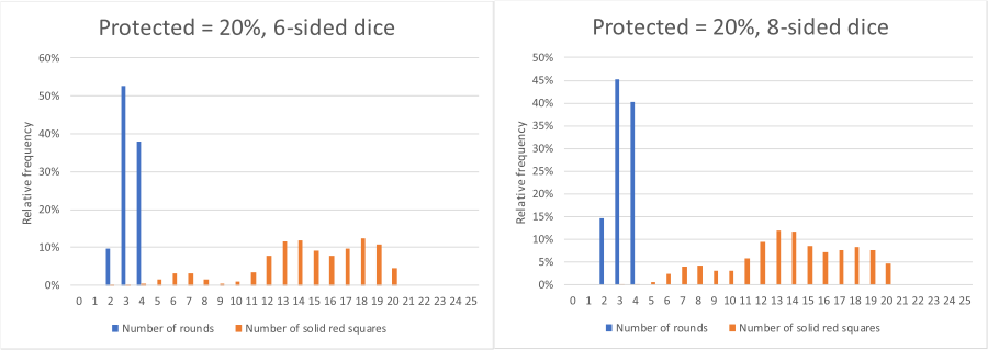
In the original game, the board was a 5x5 grid and a set of six-side dice were used. In the interactive element below, there is a choice of a 5x5 or a 9x9 grid, and a choice of a set of six or eight-sided dice (to allow for all eight neighbours to be infected). All the other rules are the same as the original. The simulation may be stepped through by clicking 'Next', or automatically run by clicking the "Auto" button.